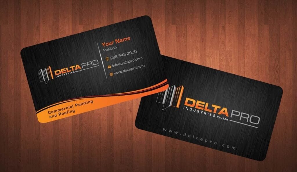
A well-designed business card can make a lasting first impression, acting as a tangible representation of a professional or brand. However, what works for a lawyer’s business card may not work for a photographer’s. Different industries have unique standards and expectations, and understanding these can help create business cards that effectively communicate credibility, professionalism, and creativity. In this article, we’ll explore what works and what doesn’t when designing business cards for different industries.
1. Corporate and Professional Services
Industries such as law, accounting, and finance thrive on trust and credibility. Business cards for these fields should reflect professionalism and authority. The design should be clean, minimalistic, and formal, using neutral color schemes like black, white, navy, or gray. Serif fonts and a simple layout with essential information—name, title, company logo, and contact details—are key.
What Works: Simple, formal, and easy-to-read designs convey professionalism and reliability. Heavy cardstock and a matte finish can also elevate the perception of quality.
What Doesn’t Work: Flashy colors, over-the-top graphics, or quirky designs can detract from a professional image. For instance, using bright neon colors might make a lawyer’s card look unprofessional, which could damage their credibility.
2. Creative Industries
Creative professionals, such as graphic designers, photographers, and artists, have more freedom to express their personal style through their business cards. These cards are often used as a canvas to showcase creativity and individuality. Bold colors, unusual card shapes, and inventive typography can be highly effective, as long as they reflect the person’s work.
What Works: Unique, eye-catching designs that demonstrate creativity can leave a memorable impact. Textures, die-cuts, and creative use of space can make the card feel like a piece of art itself.
What Doesn’t Work: Being overly experimental at the expense of legibility. If a potential client can’t easily read the card or find the essential contact information, even the most artistic design won’t be effective.
3. Retail and Hospitality
Business cards in the retail and hospitality industries, such as restaurants, hotels, or boutique shops, should evoke the experience customers can expect. Design should align with the brand’s image—whether that’s luxury, comfort, or fun. For example, a high-end restaurant might opt for an elegant, minimalist card, while a quirky café could use playful colors and fonts.
What Works: Designs that clearly reflect the brand’s personality and what customers will experience. Incorporating the brand’s logo and colors creates a strong sense of identity and helps with brand recognition.
What Doesn’t Work: Generic or disconnected designs. A luxury hotel using a low-quality or overly casual design can send the wrong message about the brand’s standard of service.
4. Technology and Startups
In the fast-paced tech world, business cards should reflect innovation and forward-thinking. Cards in this industry often feature sleek, modern designs with bold colors, geometric patterns, and futuristic fonts. In some cases, companies opt for digital business cards or cards embedded with technology like QR codes.
What Works: Modern, tech-forward designs that show the company is ahead of the curve. Incorporating elements like matte finishes, metallic accents, or interactive features such as AR integration can make a strong impression.
What Doesn’t Work: Traditional, boring designs can make a tech company seem out of touch. It’s important to avoid overly complicated cards, however, as clarity should still be a priority in conveying information.
5. Healthcare and Wellness
Healthcare professionals, from doctors to wellness coaches, need business cards that convey trustworthiness and care. Clean, simple designs with soothing colors like light blue, green, or white are often used to inspire confidence and calmness. The design should include key details such as the professional’s title, specialty, and contact information.
What Works: Professional designs that focus on conveying trust and approachability. Using easy-to-read fonts and a clear layout ensures clients can easily find the necessary information.
What Doesn’t Work: Flashy, overly decorative designs that can come off as unprofessional or distracting. For healthcare providers, legibility and clarity are essential.
Conclusion
Designing business cards that work well for different industries requires a balance between creativity and industry standards. Professionals in fields like law or healthcare should stick to classic, formal designs that communicate trust, while creatives can push the envelope with bold and innovative designs. Regardless of the industry, personalized business cards are a powerful tool in creating meaningful connections, and they should always reflect the individual or brand’s identity.
Incorporating industry-appropriate designs can make all the difference in how a card is perceived and, ultimately, how successful it is in fostering business relationships. By understanding what works—and what doesn’t—you can ensure your business card leaves the right impression.

